%20(1).svg)
How to Run Sensitivity Analysis for Finance and FP&A Teams
By Laks Satchi |
Last Updated: June 01, 2026
Every senior FP&A leader has watched a forecast fall apart in a board meeting because nobody pressure-tested the assumptions. The model looked confident on the slide. The first sharp question from the audit committee made it clear that nobody had asked what would happen if the churn rate landed two points higher than planned. Sensitivity analysis is the discipline that closes that gap.
This guide covers what sensitivity analysis is, how it differs from scenario analysis, the four types most commonly used in finance, and a six-step method walked through with real numbers. It is written for FP&A teams that want a reference they can use today, share with their team, and apply to a model this week. The technique sits at the heart of rigorous planning and forecasting, and getting it right is one of the cleanest ways to upgrade the credibility of your FP&A function.
Sensitivity analysis is the technique of changing one input in a financial model at a time, holding everything else constant, to see how the output responds. It tells you which drivers move the answer the most, which barely register, and where your forecast is most exposed to being wrong.
Three reasons drive most sensitivity analysis work in finance. The first is pressure-testing forecasts before they reach senior leadership. A revenue forecast that holds together when churn rises by two points is a different forecast from one that does not, even if both show the same number on the headline slide. The second is identifying which drivers deserve management focus. If 80% of the variance in the forecast comes from one driver, that driver deserves disproportionate attention in the operating cadence. The third is quantifying model risk in capital allocation decisions, particularly in M&A modeling, capex evaluation, and any DCF where small changes in growth or discount rate produce large changes in valuation.
Sensitivity analysis matters most in three situations. Long-horizon forecasts where compounding magnifies small input errors. Decisions that are hard to reverse, where the cost of being wrong is asymmetric. Models with drivers the team has limited visibility into, where the honest answer is "we are guessing within a range." In each of those cases, knowing how much the output moves across plausible inputs is more useful than the headline number itself.
Once the technique is clear, the next question most teams ask is how it differs from scenario analysis. The two are often used interchangeably in conversation, and the resulting confusion is the source of most poor pressure-testing in FP&A.
Sensitivity analysis flexes one driver at a time to see what moves the output. Scenario analysis flexes a coherent set of assumptions together to model a story, such as a recession or a successful product launch.
|
Dimension |
Sensitivity analysis |
Scenario analysis |
|---|---|---|
|
What changes |
One input variable at a time |
A coordinated set of input variables |
|
What it answers |
Which drivers move the output the most? |
How does the business perform under a specific story? |
|
Output |
A range or sensitivity table |
Discrete scenarios (best, base, worst) |
|
Common visualization |
Tornado chart, two-way data table |
Side-by-side scenario columns |
|
Best for |
Diagnosing model risk and driver importance |
Strategic planning and stress-testing |
|
Finance use cases |
DCF valuation, FP&A forecast reviews, capex models |
Annual planning, recession planning, M&A scenarios |
Use sensitivity analysis to find which drivers matter. Use scenario analysis to model how the business behaves in best, base, and worst case worlds. Most rigorous models use both, in that order. Sensitivity analysis tells you which drivers to flex in your scenarios. If new customer count is the most sensitive driver in your forecast, your scenarios should differ meaningfully on that driver. If ACV barely moves the output, building three scenarios that vary only on ACV will produce three nearly identical forecasts.
|
QUICK TAKE Run sensitivity first, scenarios second. Sensitivity analysis tells you which drivers actually move the output. Use that ranking to decide which drivers to vary in your scenarios. Skipping the sensitivity step is how teams end up with three "scenarios" that differ by 2% from each other. |
With the distinction clear, the technique itself takes four common forms in finance. Each answers a slightly different question, and most rigorous FP&A teams use the first three regularly. Monte Carlo simulation is more specialized and shows up most often in valuation, project finance, and risk modeling.
Flex one input at a time, hold all others at their base values, and record how the output moves. This is the simplest form and the right starting point for most models. Use it to answer: "If this single driver lands at the high or low end of its plausible range, how does my forecast change?"
Flex two inputs simultaneously, holding the rest constant, and record the output across a matrix of combinations. The output is typically a data table with one driver on each axis. Use it when two drivers interact in ways that matter, such as price and volume, or growth rate and discount rate in a DCF model.
A tornado chart ranks multiple drivers by their impact on the output and visualizes the result as horizontal bars sorted by magnitude, longest at the top. The shape gives the chart its name. It is the most useful way to present sensitivity findings to a non-finance audience because the visual answers the question immediately: which drivers matter most. Build the tornado chart from the results of multiple one-way sensitivity analyses, one per driver.
Monte Carlo runs thousands of simulations across probability distributions of multiple inputs simultaneously. Instead of flexing each driver to a single high and low value, you specify a distribution for each driver (normal, triangular, uniform) and let the simulation produce a distribution of possible outputs. The result is a probability statement: "There is a 70% chance ARR ends between $12M and $14M." Monte
Carlo is more powerful than one-way or two-way sensitivity but also requires more disciplined input data and software that can run the simulations cleanly. Most mid-market FP&A teams do not need Monte Carlo for routine forecasting, though it is increasingly common in capital allocation and risk modeling.
Theory is fine. Application is what matters. Here is the six-step method walked through with a worked example: a B2B SaaS company forecasting next year's ARR. The same method works for capex models, M&A models, DCF valuations, and any other forecast where the output is sensitive to a small set of drivers.
The example setup: starting ARR of $10.0M, four key drivers (new customer count, ACV, churn rate, expansion rate), and a forecast horizon of one year.
Pick one number to sensitize. The whole analysis collapses if the output is fuzzy. Common output variables in FP&A include ending ARR, EBITDA, free cash flow, NPV, or terminal value. For our example, the output is ending ARR for next year.
Two failure modes to avoid here. Picking an output too high in the model (such as enterprise value) when the question is really about an input two levels down. And picking an output that is composed of so many drivers the analysis becomes unreadable.
List the inputs that meaningfully affect the output. Most FP&A models have 5 to 10 real drivers, even when the underlying spreadsheet has hundreds of input cells. The rest are derived calculations or constants. For our SaaS forecast, the four key drivers are:
|
PRO TIP If you have more than 7 candidate drivers, run a quick one-way sensitivity on each at the start, then drop the ones that move the output less than 1%. Sensitivity analysis is most useful when it focuses on the drivers that actually matter. |
Each driver gets a low value, a base value, and a high value. The ranges should reflect plausible real-world variation, not arbitrary symmetric percentages. A churn rate cannot go below zero. New customer count is bounded by sales capacity. Use historical data, sales pipeline, and management judgment to set ranges that mean something.
For our example, the ranges are:
Start by calculating the base case. For our model:
Now flex each driver one at a time, holding the rest at base, and record the resulting ending ARR. The results for our example:
|
Driver |
Low case |
Base |
High case |
Total swing |
|---|---|---|---|---|
|
New customer count |
$12.5M |
$13.0M |
$13.5M |
$1.0M |
|
Net expansion rate |
$12.5M |
$13.0M |
$13.4M |
$0.9M |
|
Gross churn rate |
$12.5M |
$13.0M |
$13.3M |
$0.8M |
|
ACV |
$12.6M |
$13.0M |
$13.4M |
$0.8M |
The drivers above are sorted by total swing (high case minus low case), which is the format that turns into a tornado chart in step 6.
This is where most FP&A teams stop too early. The numbers in the table mean something, and the meaning is what gets communicated to leadership. Three observations from our example:
First, new customer count is the single biggest lever. A swing of $1.0M on a $13.0M ARR forecast is roughly 7.5% of the total. If sales execution lands at the low end of plausible, the forecast misses by nearly $0.5M from this driver alone.
Second, expansion rate and churn rate are nearly tied for second place, and the ranges interact. A bad year for retention typically also produces a bad year for expansion, since expansion comes from the same customer base. Treating them as independent in a one-way analysis underestimates the real downside risk. This is one place where a two-way sensitivity (churn and expansion together) adds genuine information.
Third, ACV has the smallest impact. That is useful to know. It does not mean ACV is unimportant, only that under the ranges defined here, ACV will not drive the forecast result. Management attention is better spent on the other three drivers, particularly new customer count.
The output of a sensitivity analysis is usually summarized in three artifacts: a tornado chart, a one-paragraph narrative, and a recommendation.
The tornado chart shows each driver as a horizontal bar, with bar length representing the swing in the output. Drivers are sorted top to bottom by impact, with the largest at the top. For our example, the chart would show new customer count at the top with a bar spanning $12.5M to $13.5M, and ACV at the bottom with a bar spanning $12.6M to $13.4M.
The narrative explains the chart in business terms. For our example: "New customer acquisition is the largest single risk to next year's ARR. A 20% miss on new logos translates to roughly $0.5M of forecast risk. Expansion and churn are the next most material drivers, and they tend to move together in a downturn, so the combined downside risk is larger than either driver shows in isolation. ACV variation within the planning range has limited impact on the forecast."
The recommendation translates the analysis into a management decision. Where should the operating cadence focus? What KPIs should be tracked weekly versus quarterly? What contingencies should be built into the plan? In our example, the recommendation might be that the sales team's weekly pipeline review becomes the most important meeting on the calendar, since new customer count is where the forecast is most exposed.
|
EDITOR'S NOTE If you want to go deeper on the forecasting side of this technique, our guide to AI financial forecasting covers how modern FP&A platforms generate baseline forecasts that sensitivity analysis can then pressure-test. |
Knowing the method is half the work. The other half is avoiding the mistakes that even experienced FP&A teams make. Five show up most often.
Plus or minus 10% is a comfortable default, and often wrong. Churn rate cannot go negative, so flexing it by 8% in both directions creates an impossible low case. Customer count is bounded by sales capacity in the high case but only by zero in the low case. Use historical ranges and management judgment to set bounds that reflect reality.
One-way sensitivity holds every other driver at base while flexing one. In a real downturn, drivers move together. Customer acquisition slows, churn rises, expansion contracts. Treating these as independent understates downside risk. Two-way sensitivity, scenario analysis, or Monte Carlo are the tools that handle correlation properly. Use them when the correlation is material to the decision.
It is tempting to set ranges that produce a comfortable result. Resist this. The whole point of sensitivity analysis is to find out what could go wrong. Set ranges based on history and judgment, then live with what the analysis shows. If the result is uncomfortable, that is information. If the result is comfortable because the ranges were narrow, that is self-deception.
"ARR ranges from $13.27M to $13.84M" implies more confidence than the method supports. The output of a sensitivity analysis is approximate. Round to one decimal place at most, and use round numbers in the tornado chart and narrative. The audience interprets precision as confidence, and overstating confidence is the original sin of forecasting.
Sensitivity analysis done at the start of the budget cycle is useful for the first month. By the third month, actuals have come in, drivers have moved, and the original analysis is stale. The teams getting this right rerun their sensitivity analysis at every monthly close, with updated base values and adjusted ranges. This is one of the strongest arguments for moving sensitivity analysis out of static Excel files and into a system that refreshes automatically.
|
WATCH OUT Symmetric percentage flexing is the most common mistake. If you remember one thing from this section: ranges should reflect realistic distributions, not comfortable round numbers. Flex churn from 5% to 12%, not 8% ± 2%. The shape of the answer changes when the inputs are bounded honestly. |
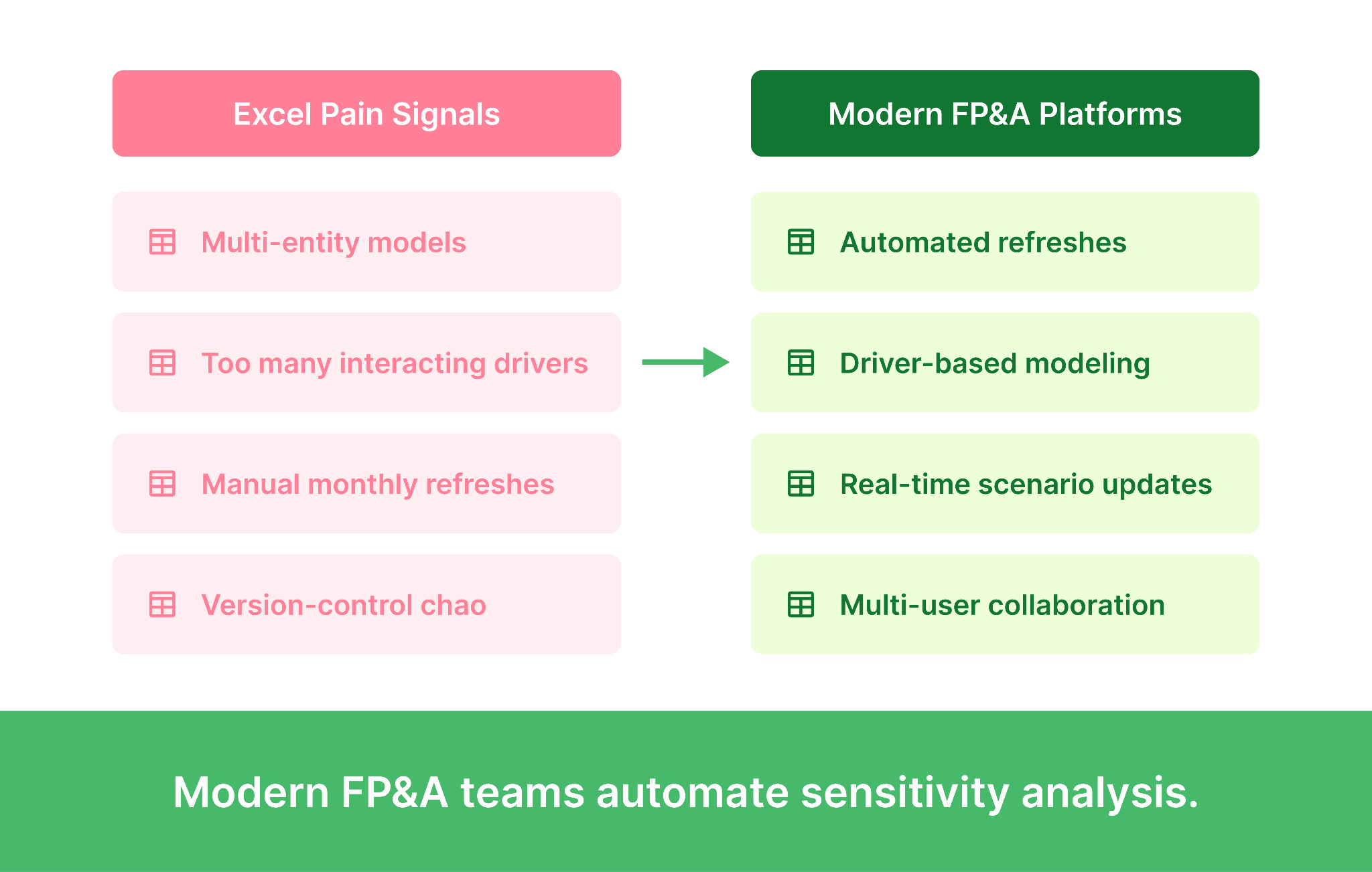
Even when the method is sound and the pitfalls are avoided, the tooling itself can become the constraint. Excel data tables work well for small, single-entity models with three or four drivers. Beyond that, the gap between what the technique can do and what Excel can support starts to widen.
Four signals tell most FP&A teams it is time to move sensitivity analysis off spreadsheets:
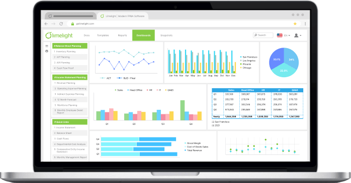
Driver-based FP&A platforms store drivers and outputs in a structured database rather than a worksheet. What-if scenarios run server-side, results refresh automatically with new actuals, and multiple users can work on the same model with proper version control. Sensitivity analyses that took half a day in Excel run in seconds, and the analyst spends the saved time on interpretation rather than rebuilding tables. Limelight's planning and forecasting capability is purpose-built for this kind of work, with real-time data refresh from the ERP and an analytical engine that lets the FP&A team build and modify models without external consultants.
|
MUST READ If your team is rerunning sensitivity analysis every month manually, you are not running sensitivity analysis often enough. Automate it. See how Limelight handles it natively. |
Sensitivity analysis is the cheapest forecast-quality upgrade available to most FP&A teams. The method is straightforward, the worked example above is reproducible on any model, and the payoff shows up the first time a board member asks what happens if churn lands two points higher than planned.
Three concrete next steps based on where your team is today.

Sensitivity analysis is the practice of changing one input in a financial model at a time to see how the output responds. It tells you which assumptions in your forecast matter most and which barely move the answer. FP&A teams use it to pressure-test forecasts before they reach the board.
Sensitivity analysis flexes one driver at a time. Scenario analysis flexes a coordinated set of drivers together to model a story (recession, successful product launch, competitor entry). Sensitivity analysis answers "which drivers move the output the most?" Scenario analysis answers "how does the business perform under a specific story?" Most rigorous models use both, with sensitivity first to find the drivers worth varying in scenarios.
The most common approach is Excel's data table feature (Data > What-If Analysis > Data Table). Set up your model with named input cells, create a table with the input values you want to flex along one or two axes, and Excel will populate the output for each combination. For multiple drivers, build separate one-way data tables for each, then summarize the results in a tornado chart. Excel works well for small models. Larger models with multi-entity structures or many interacting drivers usually outgrow it.
A SaaS company forecasts next year's ARR at $13.0M based on assumptions about new customer count, ACV, churn rate, and expansion rate. The FP&A team runs a sensitivity analysis flexing each driver to its plausible range. The result shows new customer count is the largest single lever (a $1.0M swing in ARR), followed by expansion rate, churn rate, and ACV. This tells leadership where to focus operational attention and where the forecast is most exposed if execution slips.
A tornado chart is a horizontal bar chart that ranks drivers by their impact on the output, with the largest impact at the top and the smallest at the bottom. Each bar shows the swing in the output as that driver moves from its low case to its high case. The shape resembles a tornado, which is where the name comes from. It is the standard way to present sensitivity findings to a non-finance audience because the visual immediately communicates which drivers matter most.
Forecasts are only as good as the assumptions underneath them. Sensitivity analysis quantifies how exposed a forecast is to being wrong, separates the drivers that genuinely matter from the noise, and gives leadership a clearer view of model risk. In capital allocation, M&A, and DCF valuation, sensitivity analysis is the technique that turns a single number into an honest range, which is what most decisions actually need.
Subscribe to our newsletter